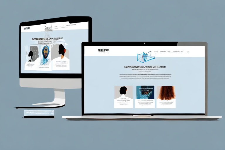
Responsive web design is an approach to web design that allows a website’s layout and design to adjust automatically to fit the device, screen size, and orientation of the device that is being used to view it. Responsive design is essential for any website today, as device sizes, orientations, and platform capabilities vary widely. By making a website responsive, users get the best experience possible regardless of the device they are using.
What is Responsive Design?
Responsive design is based on a combination of flexible grids and layouts, images, and SVG (Scalable Vector Graphics) which fills the screen to ensure all content looks its best no matter what device or screen size you are using. As the browser size changes, so does the layout of the website. It can display different versions of the same website depending on the device or screen resolution. Content is scaled proportionally to ensure that it looks its best no matter how it is displayed.
Responsive design is an important part of modern web design, as it allows websites to be easily viewed on a variety of devices. It also helps to ensure that the website is optimized for search engine rankings, as it is easier for search engines to crawl and index websites that are optimized for multiple devices. Responsive design also helps to improve user experience, as it ensures that the website is easy to navigate and use on any device.
Advantages of a Responsive Web Design
The biggest advantage of using a responsive design on your website is having a user experience that works on all devices. A responsive design eliminates the need to have multiple versions of a website for different devices. This helps create a seamless user experience and increases user engagement. It also removes the need for creating separate mobile and desktop websites, as one site can adjust to different screens and devices.
Disadvantages of a Responsive Web Design
The biggest disadvantage of using a responsive design on your website is that certain features or functions may be sacrificed when adapting the design to different devices. Some times it can be hard to get the desired display on a certain device or make certain elements adjust smoothly. As the design needs to adjust to different screen sizes, there can be issues with spacing, layout, and user experience.
Tips for Implementing Responsive Design
When implementing a responsive design there are a few important tips to keep in mind. First, optimize your website’s images to ensure that they look their best on any device or screen size. Image optimization will help your website load faster and improve the user experience. Second, make sure to test your website on various devices and browsers to make sure it looks and functions correctly. Finally, use media queries to create breakpoints where your design will adjust according to the device being used.
Benefits of Having a Responsive Website
By having a website with a responsive design you are guaranteeing that users have an optimal experience when viewing your site regardless of the device they are using. This makes your site more accessible and helps with SEO rankings since search engines favor websites that can be accessed on all devices. Having a website with a responsive design also helps you stay ahead of design trends and future-proof your site.
Challenges of Implementing Responsive Design
The biggest challenge when implementing a responsive design is making sure it looks great on all devices and browsers. Responsive design requires a lot of testing on multiple devices and browsers as different web browsers and platforms render websites differently. There can also be challenges with integrating certain elements into your website such as video or animation as these elements need to be adjusted to look their best on all devices.
Tools and Resources for Building a Responsive Website
There are many tools available to help you with creating a website with a responsive design. Some popular tools include Adobe Dreamweaver which has tools for creating responsive designs, as well as frameworks like Bootstrap which can help streamline the development process. There are also many tutorials available online to help you get started creating a responsive website.
Analyzing Your Site for Responsive Design Potential
Once you have decided to create a responsive website it is important to analyze your existing site to decide how best to create your new site. Take into account user behavior, conversion goals, any existing traffic sources, and elements like images, HTML, JavaScript, and styling CSS. Once these elements have been taken into account then you can begin developing your new site.
Testing Your Site for Mobile Compatibility
Before launching your new website, it is essential to test it across various devices and browsers to make sure everything looks and functions correctly. This includes testing on different operating systems, browser versions, and device types. You should also consider testing with accessibility tools that simulate disabilities and test how users with disabilities interact with your site.
How to Optimize Your Site for Multiple Devices
Once you have determined that your site works correctly across all devices, you need to ensure that it runs optimally on all devices. This includes optimizing images to ensure your site loads quickly across all devices, minifying HTML, CSS and JavaScript files and compressing images, as well as caching content if possible. The aim of optimization is to ensure your website provides an optimal experience across all devices.